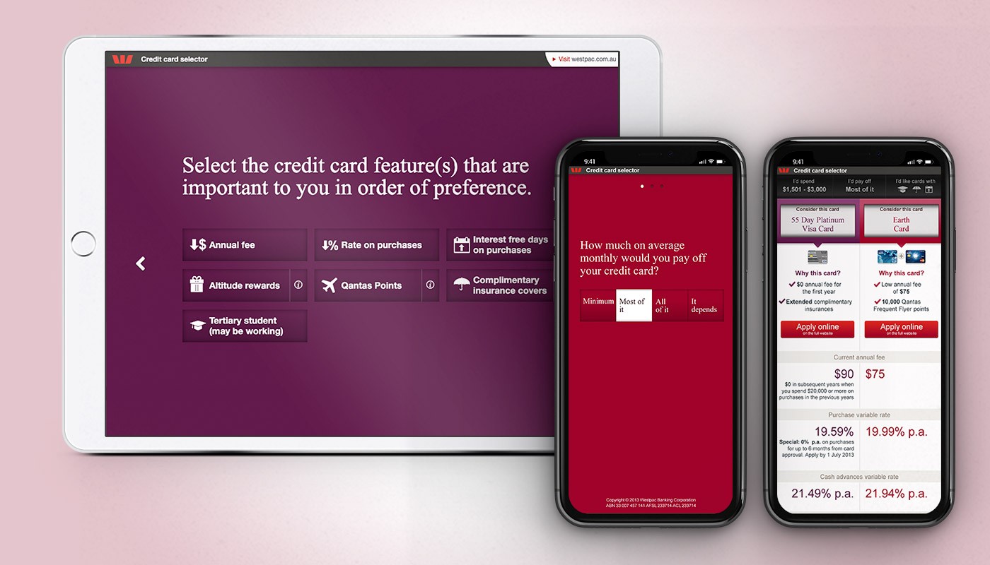
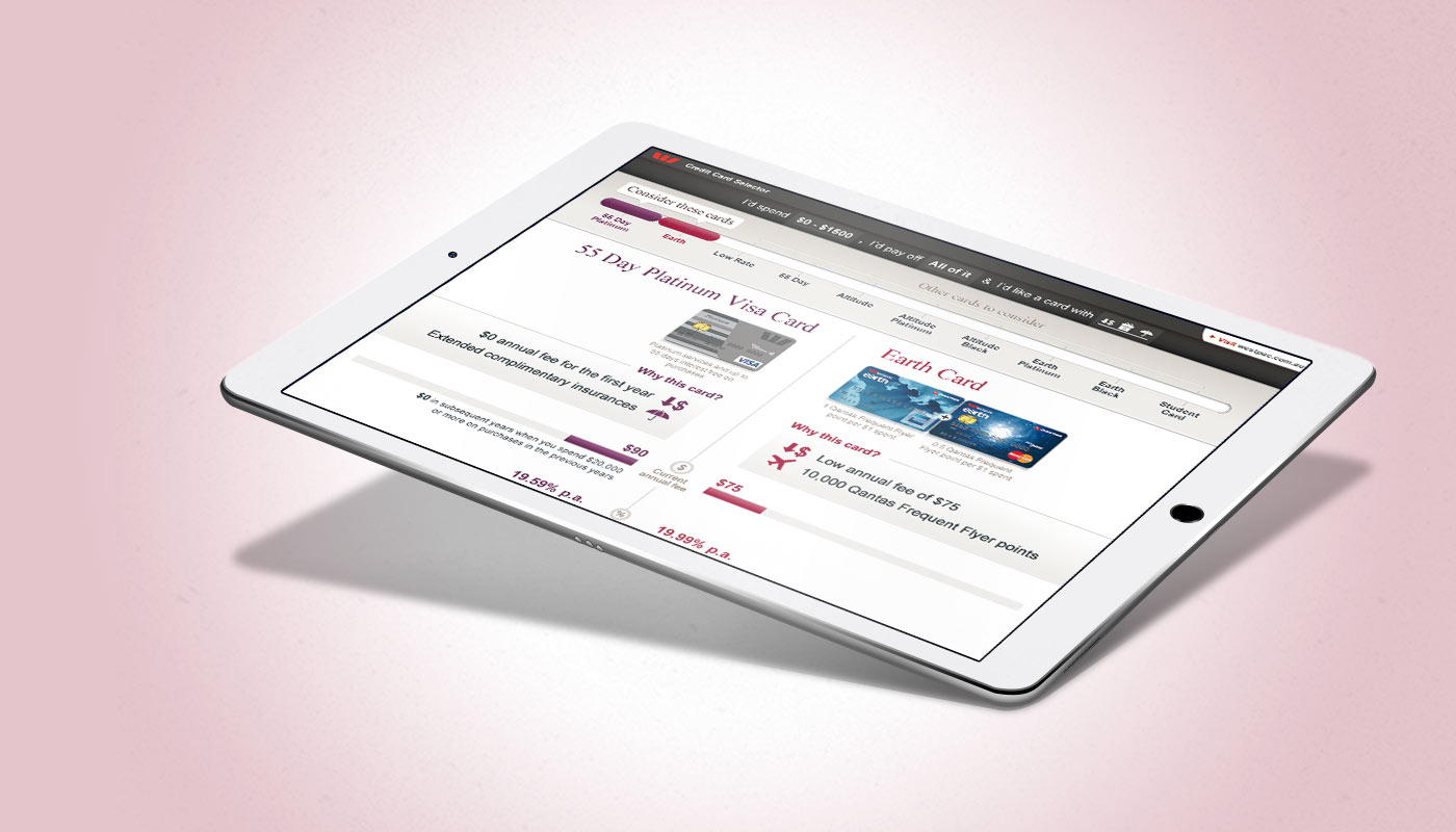
A review was done of the key banks in Australia to see what is being done already and how we can do better.
Most banks were focusing on the following characteristics: monthly payoff, special card features, annual income, spending habits, rewards programs, average monthly spend.

Some of the banks reviewed for research
A simple user flow diagram was created to help with the initial concepts for testing.
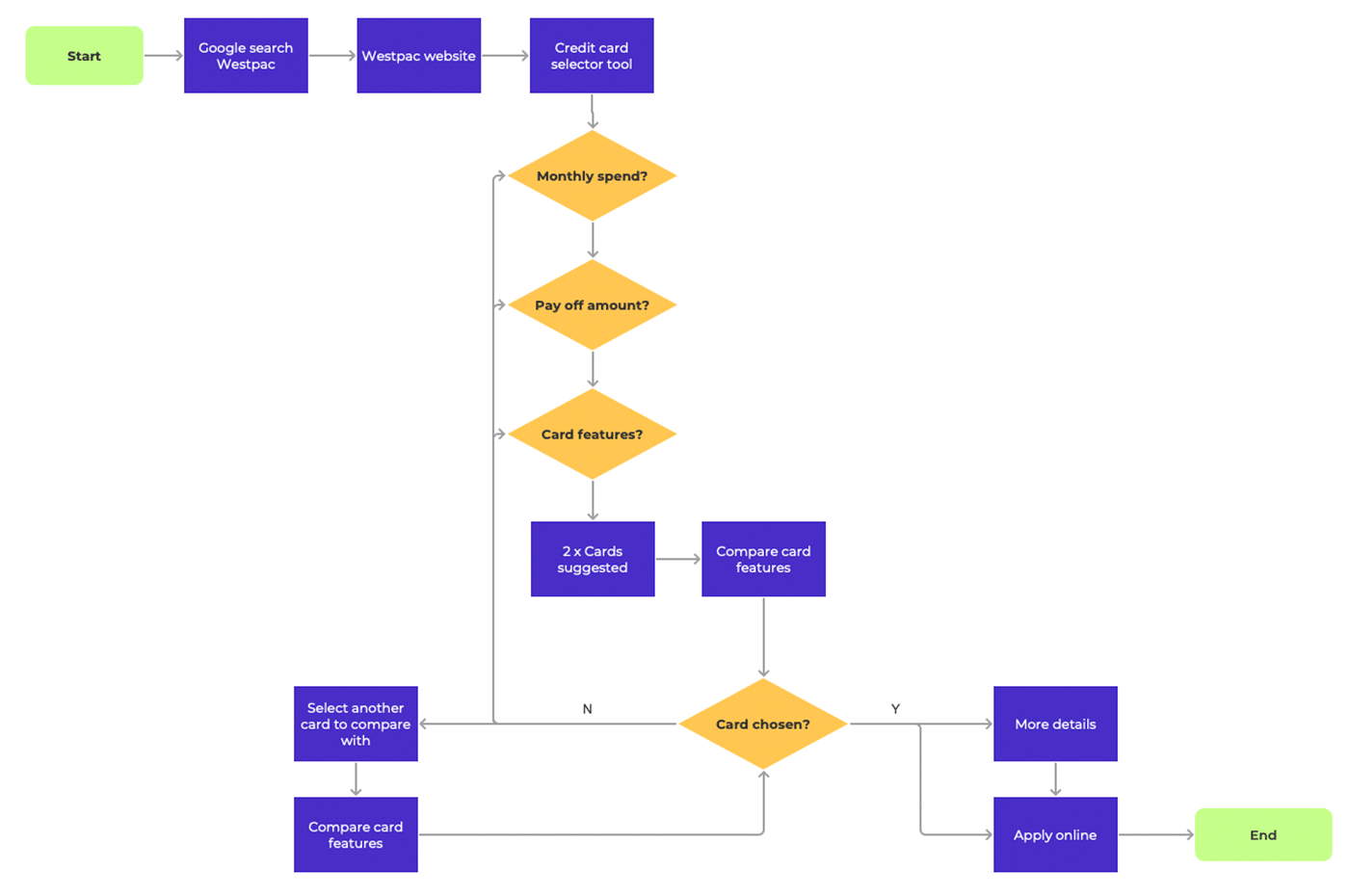
Suggested user flow.
Some low fidelity concepts were created to put in front of some users to start the design process.
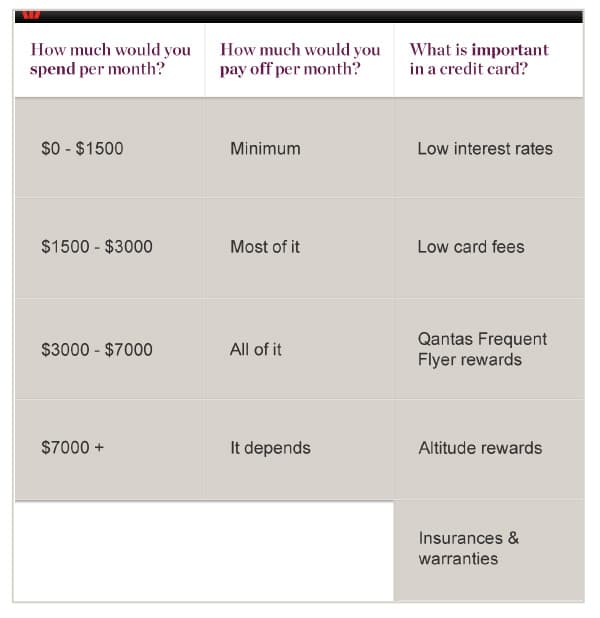
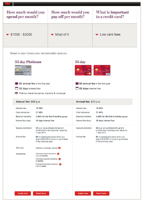
Concept 1

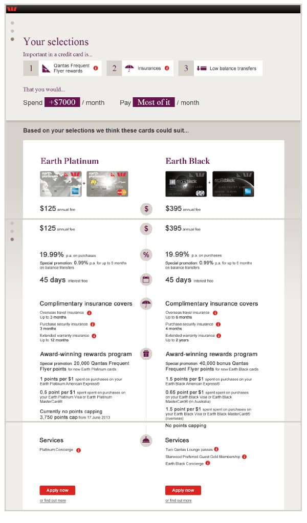
Concept 2
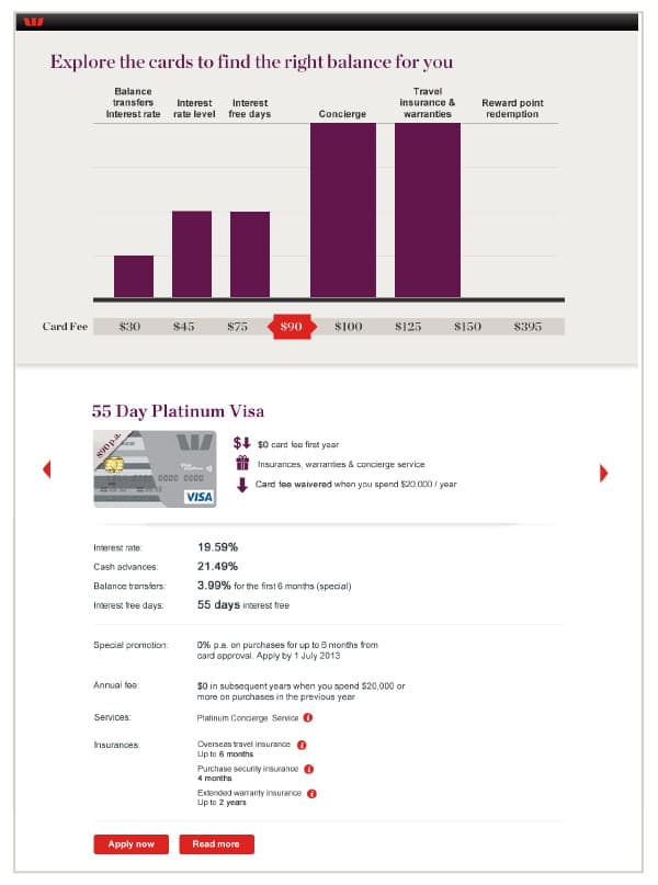
Concept 3
At the end of the session users were asked to express a preference between the 3 concepts, the majority of users preferred concept 3. They liked that at a glance they could see all credit cards ordered by fee as well as a graphical representation of the related features.
In regards to the credit card recommendations, the general preference was to have 2 cards presented side by side. That way they could compare the credit cards without having to continuously flip through different cards.
The prototype concepts were refined further to incorporate the validations and include more user interface design. Then they were tested again with more users.
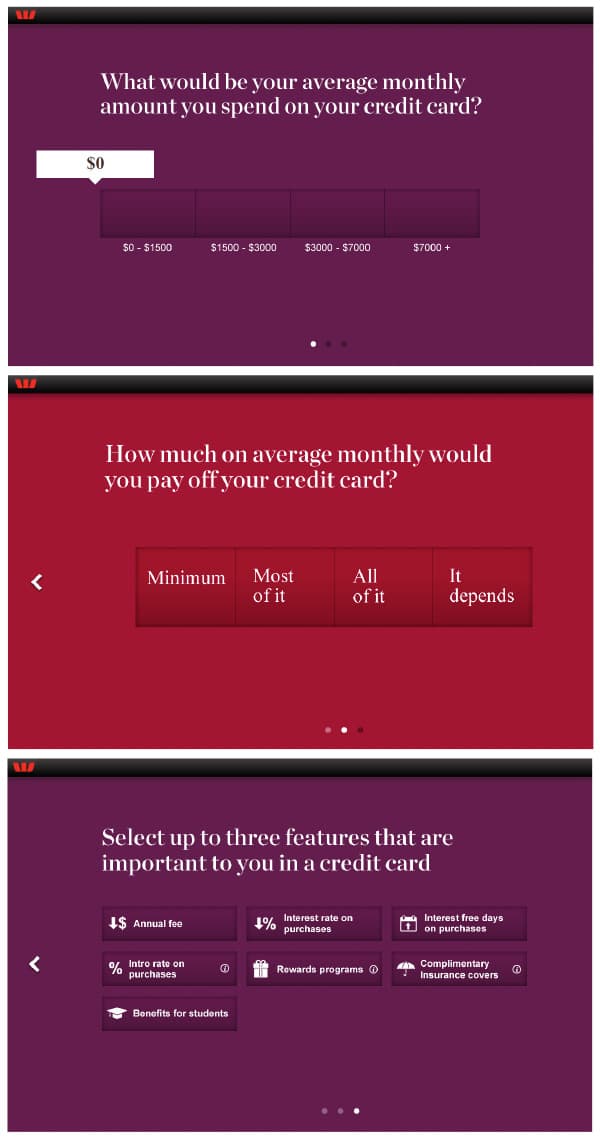
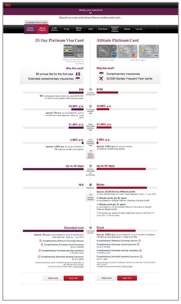
Concept 1
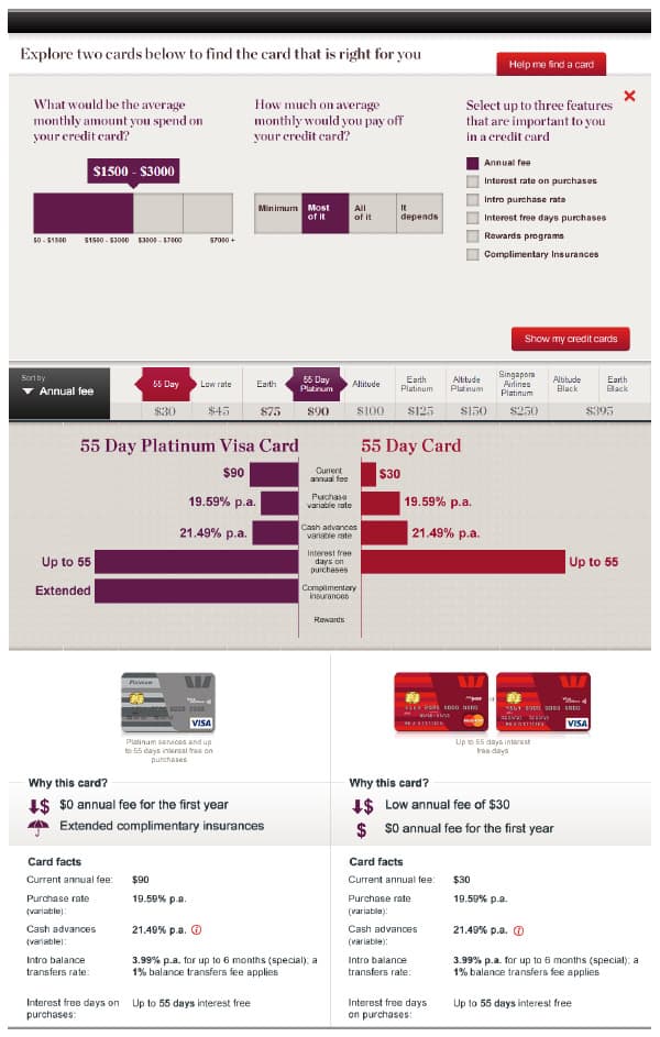
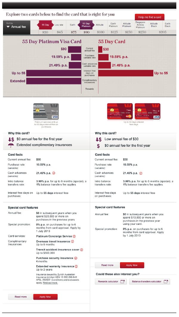
Concept 2
Concept 1 was the preferred version mainly because the participants did not have to learn how to use it and it was found to be fast and straight to the point.
Concept 1 was preferred for information display about the credit cards, as it was seen as less text heavy (even though it was the same content).
Overall, participants preferred to have the questions asked before being presented with recommendations.
We had two very refined concepts for round 3, this was all about testing the final details to get it all right.
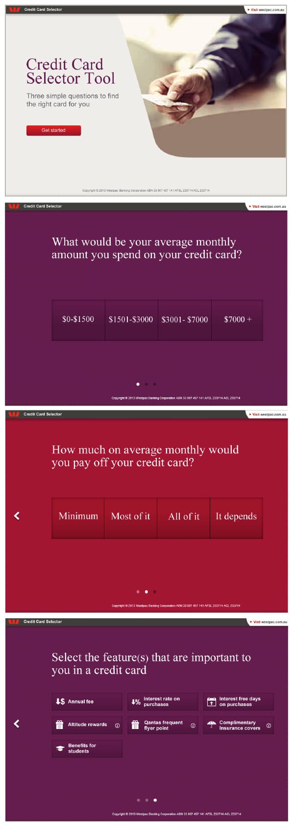
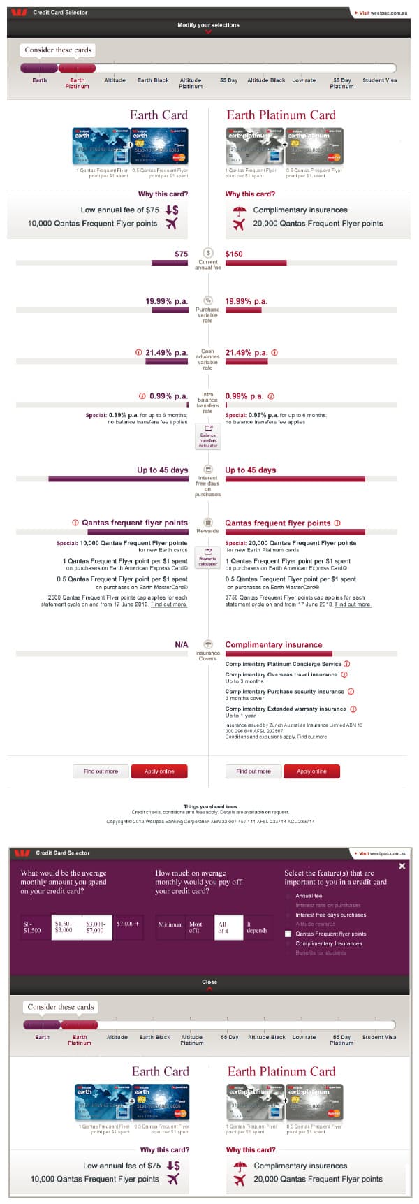
Concept 1
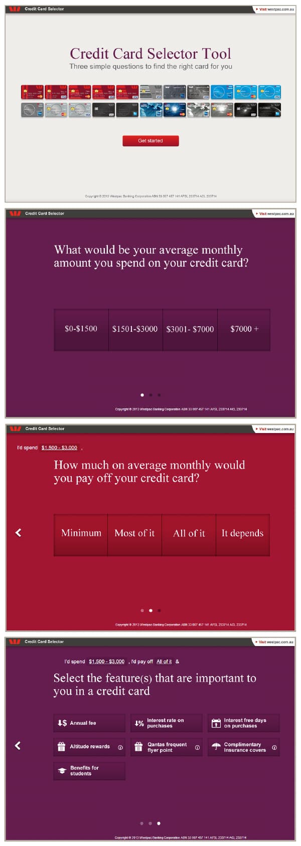
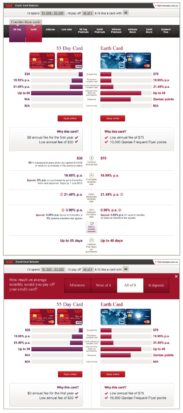
Concept 2
Almost all users preferred the slider in concept 1, as they found it easier to use.
Concept 1 was more popular for the way recommendations were presented and compared, because it was cleaner and it didn't have the same information repeated twice like in concept 2, where the graphical snapshot at the top was found to be redundant.
