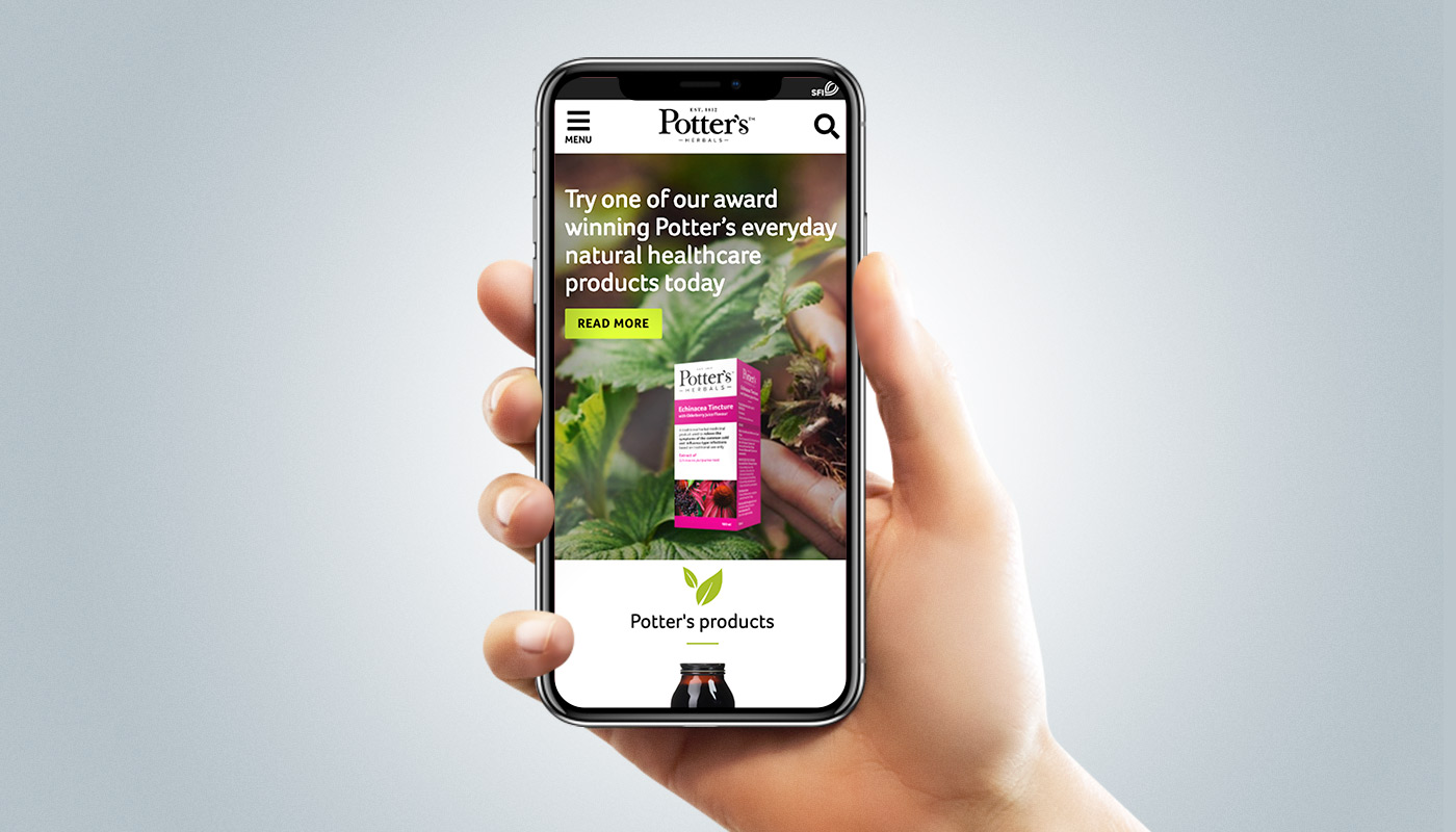

Challenges to be addressed were:
Stakeholders were both in the UK & Australia
Improve the user experience
Develop a digital style guide
Bring the brand to life
Convey the story of the unique products to users
Users of the site are general public & healthcare professionals. Both are looking for natural products that are suitable for a particular health concern & need to establish trust quickly.
Healthcare professionals are looking for patient recommendation purposes. General public are researching for themselves or a loved one.
Competitor research was done to see what the competitors in the market are doing. Some of the findings of this research included:
Very few sites were responsive
Very few had a website that established trust
Many sites had a health blog
Content is king. A deep understanding of the type of content that is to be on the site is needed before moving into developing an appropriate structure.
A initial internal workshop was conducted, here I mapped out the pages within the site, as well as the potential content components of each of those pages.
I then brought the stakeholders in to collaborate with them on the approach.
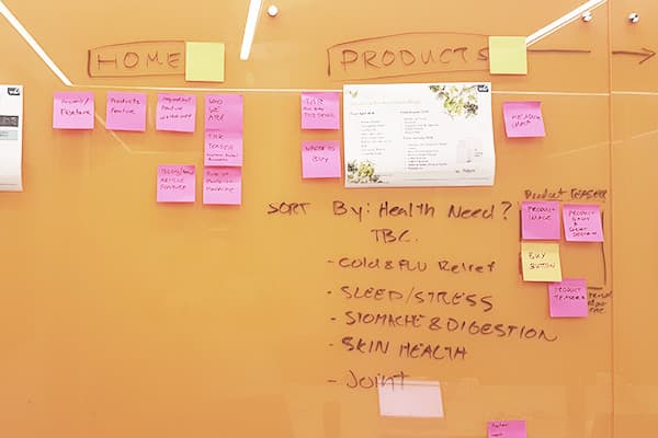
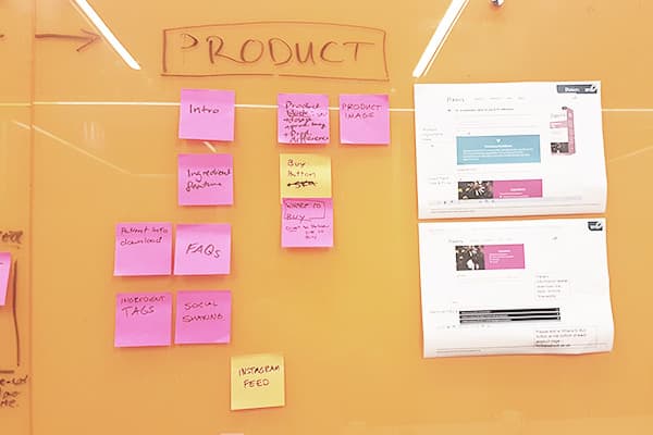
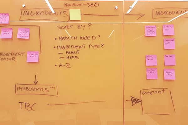
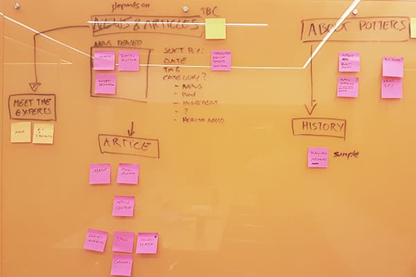
Information architecture workshop.
Outcomes from the workshop were then documented into an IA map.
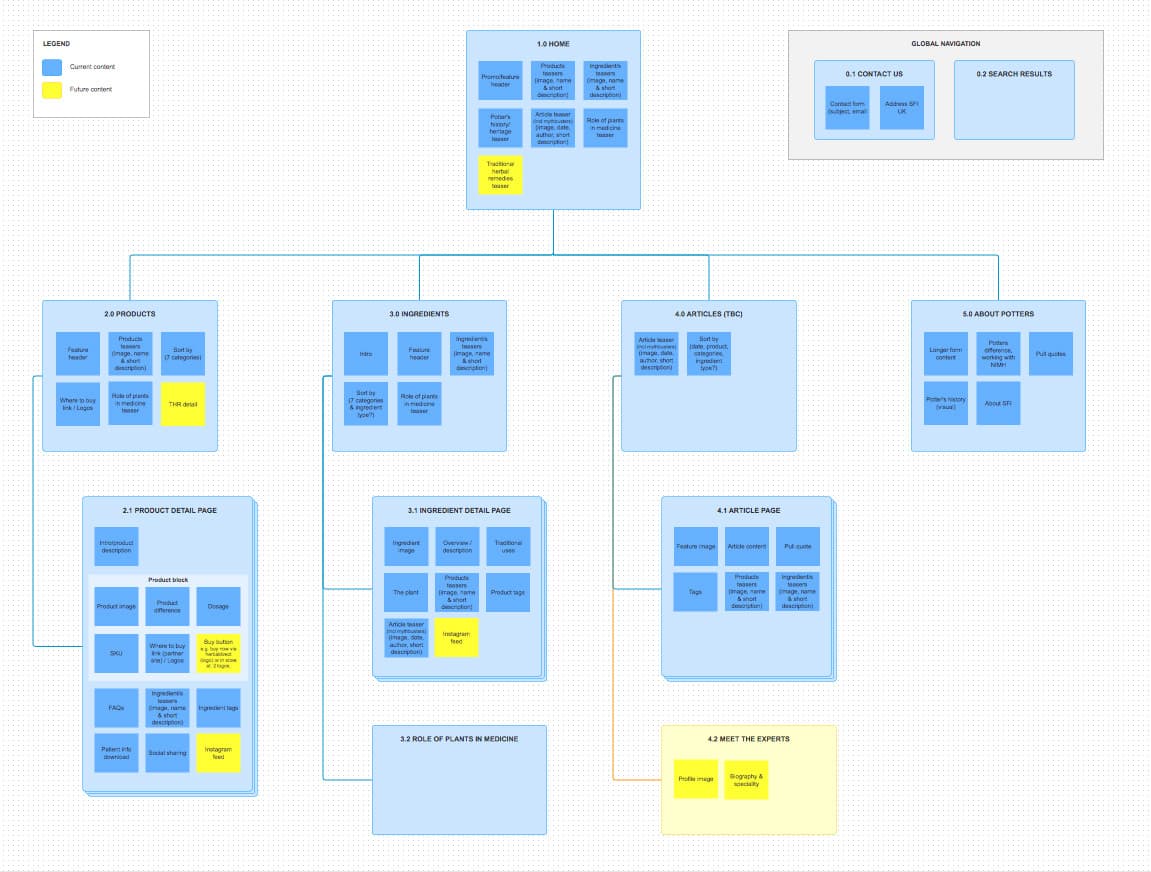
IA sitemap.
Using Axure RP, a responsive prototype was created. All key page templates were wireframed:
Home
Products
Product detail page
Ingredients
Ingredient details page
News articles
Key branding pages.
Using the Axure I was able to quickly and effectively build in the functional specifications of the site for ease of interpretation for the stakeholders as well as developers. This included:
Navigation interactions
Bespoke interactions
CMS build requirements
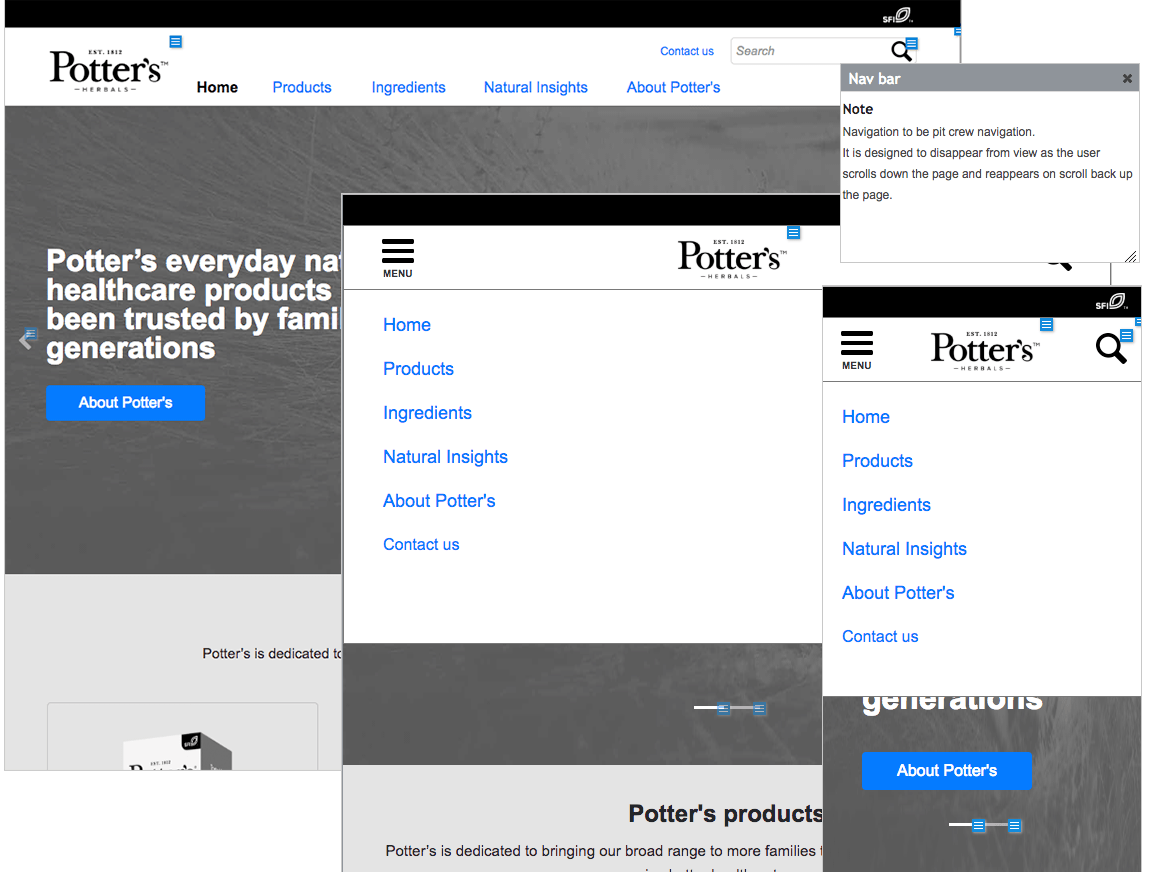
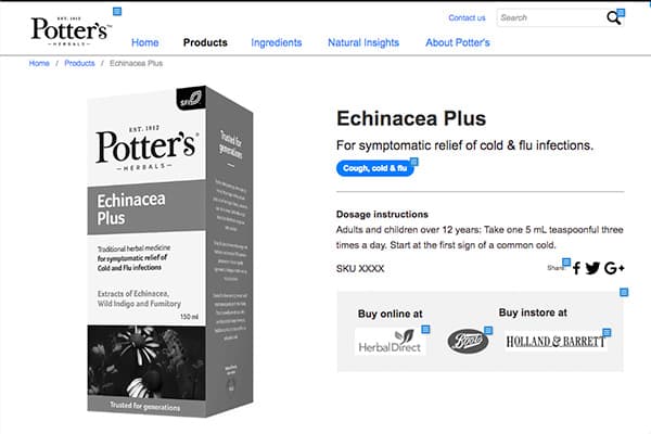
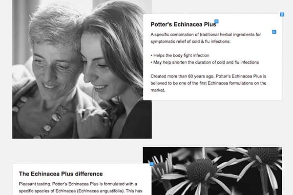
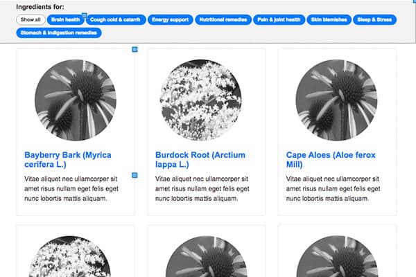
Wireframes
From research of other companies in the market as well as the newly developed brand guidelines. A visual moodboard was created to kick off the interface design process.

Moodboard.
Using webflow as a tool, I designed the UI in the form of a responsive prototype.
Key pages as well as an online styleguide was then developed.
Creating an interactive prototype instead of flat mockups allows our stakeholders to really use the site as if it were a finished product. It allows us flexibility to show how interactions work which brings everything to life. It is also very easy to test with users.

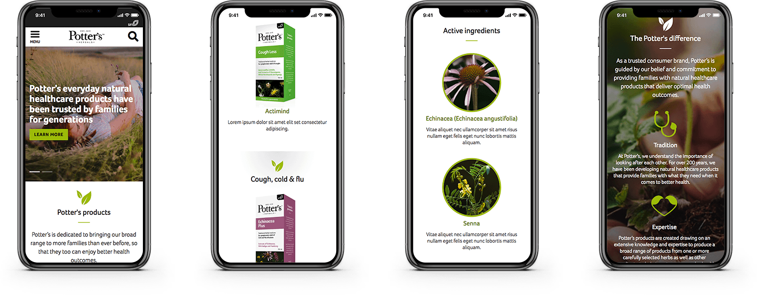
Final UI designs.
As a final piece to the puzzle, I developed an online reference guide to showcase all the user interface styles used throughout the site.
This is essential for the developers to build and for future content creators for the site.
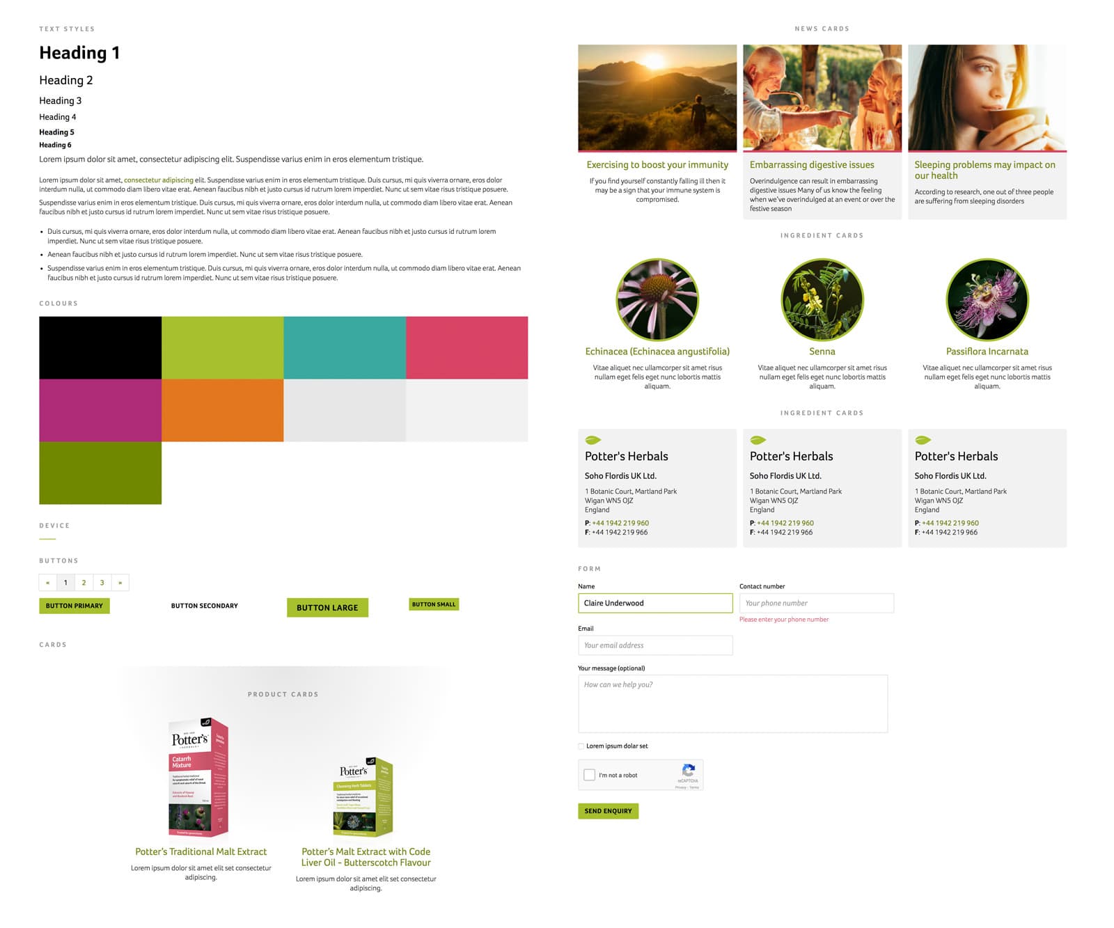
Digital pattern styleguide.
