
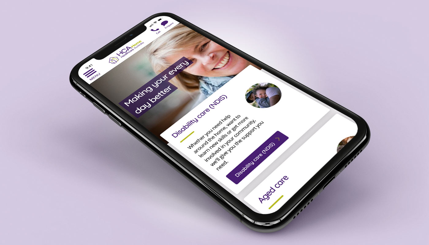
Challenges to be addressed were:
Multiple user groups with varying needs
Be empathetic and human
Build a sense of trust
Provide sufficient information in formats that make sense to the various user groups
Site must adhere to accessibility guidelines
The client had no content, this needed to be developed in conjunction with the website
User groups that were defined were
Aged care carers
Children of elderly in need of assistance
Prospective employees
People living with a disability
Disability carers
Parents of a child living with a disability
Prospective employees
Additionally, aged care and disability care is not a one fit option. Each individual is looking for a different level of care to fit their personal circumstances.
Based on the defined user groups, an IA map was created to guide the beginning of low fidelity wireframes.
I decided to have two clear sections for Aged Care & Disability Care. This way if the user was to organically land anywhere in the site they could quickly & easily identify where they were and navigate to the relevant section.
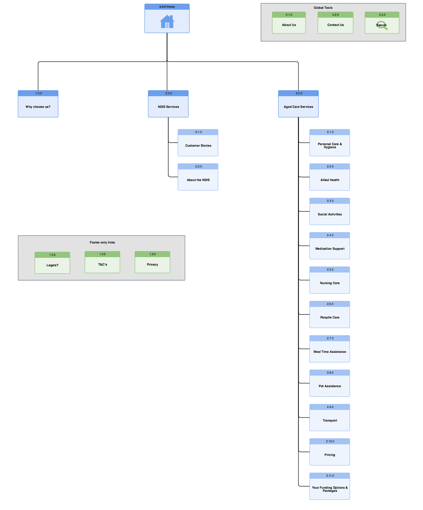
IA sitemap.
Using Balsamiq I created low fidelity wireframes.
As this was a new site with no exisiting content, low fidelity wireframes were created to guide; what type of content as well as the amount there should be on each page.
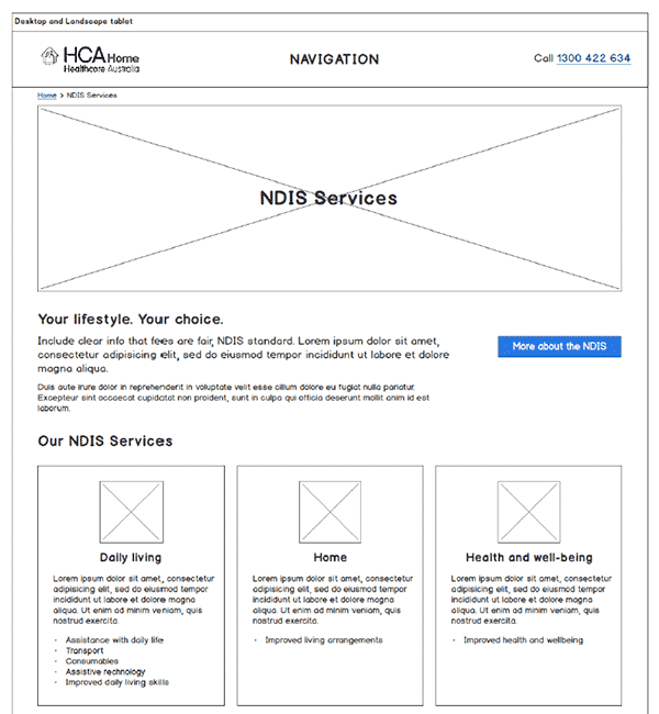
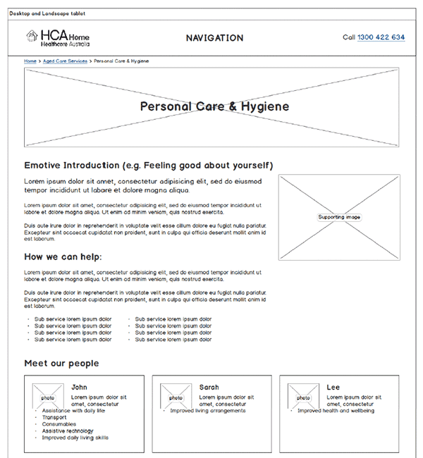
Low fidelity wireframes to help with content creation.
Using Balsamiq again, I created high fidelity wireframes with the newly developed content.
All key page templates were wireframed:
Home
Aged Care services
Aged Care service
Disability Care services
Disability Care service
Why choose HCA?
Customer stories
Contact page
Some of the key featured were:
Mega flyout nav for both 'Aged Care' & 'Disability Care' to show all the services at one glance
Ways to navigate between all services easily
Smart contact forms
Development of a content hierarchy
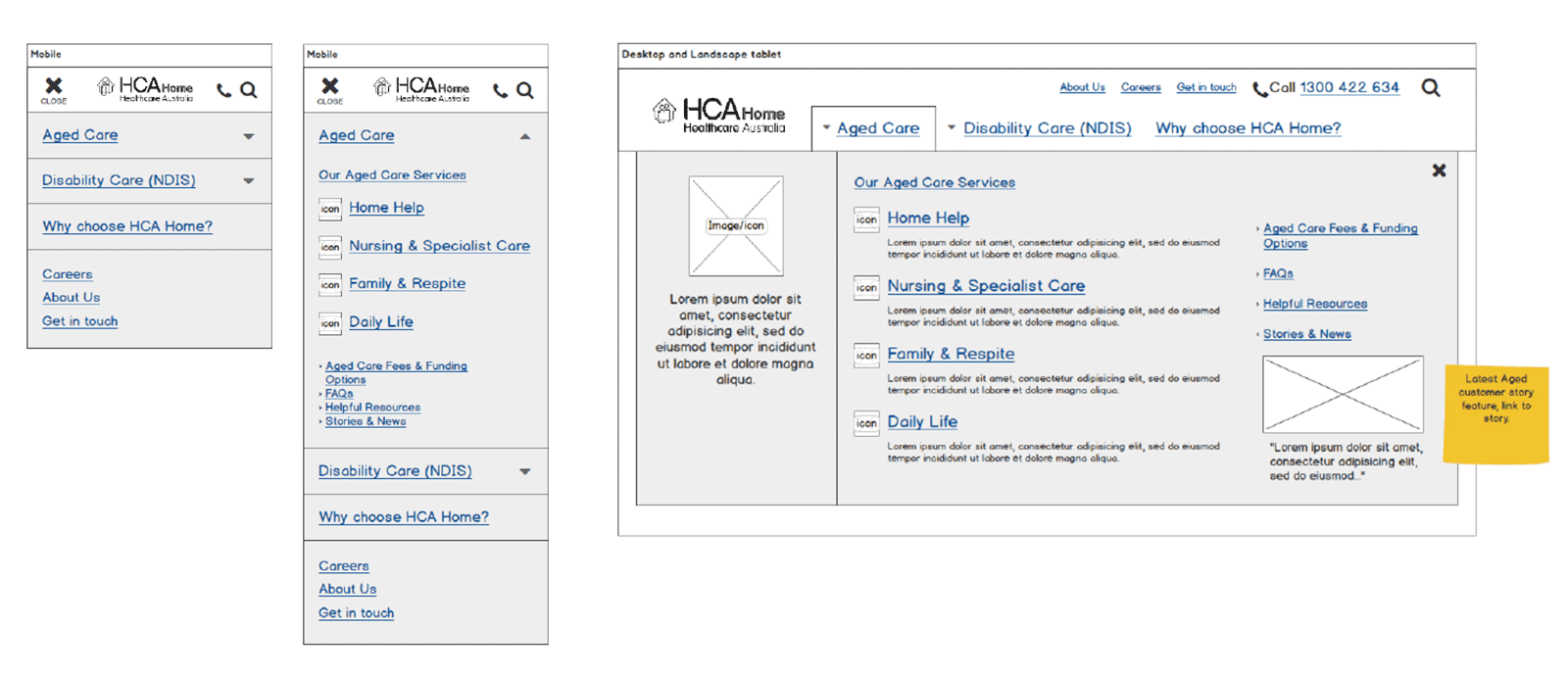
Navigation
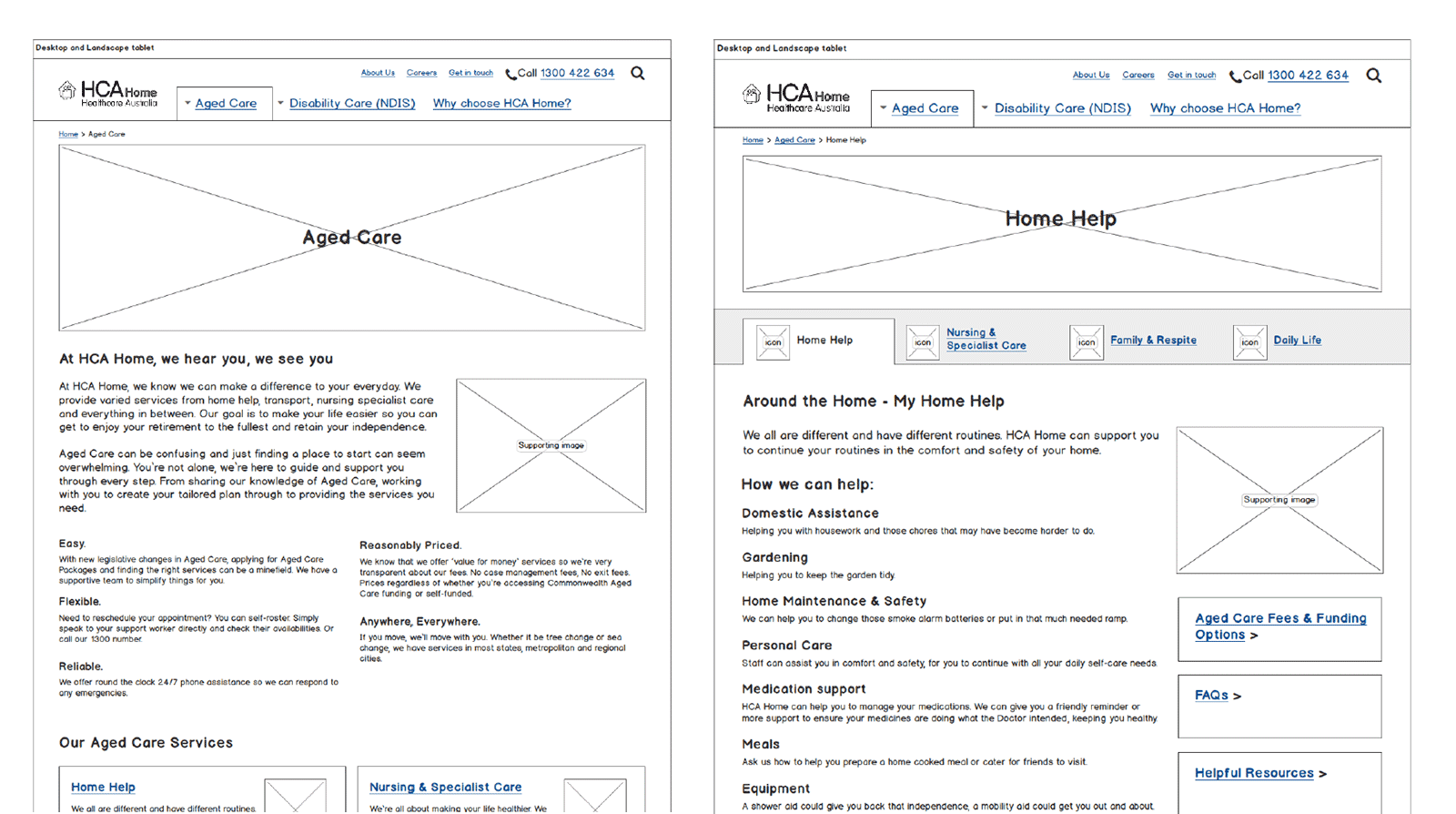
Aged care section
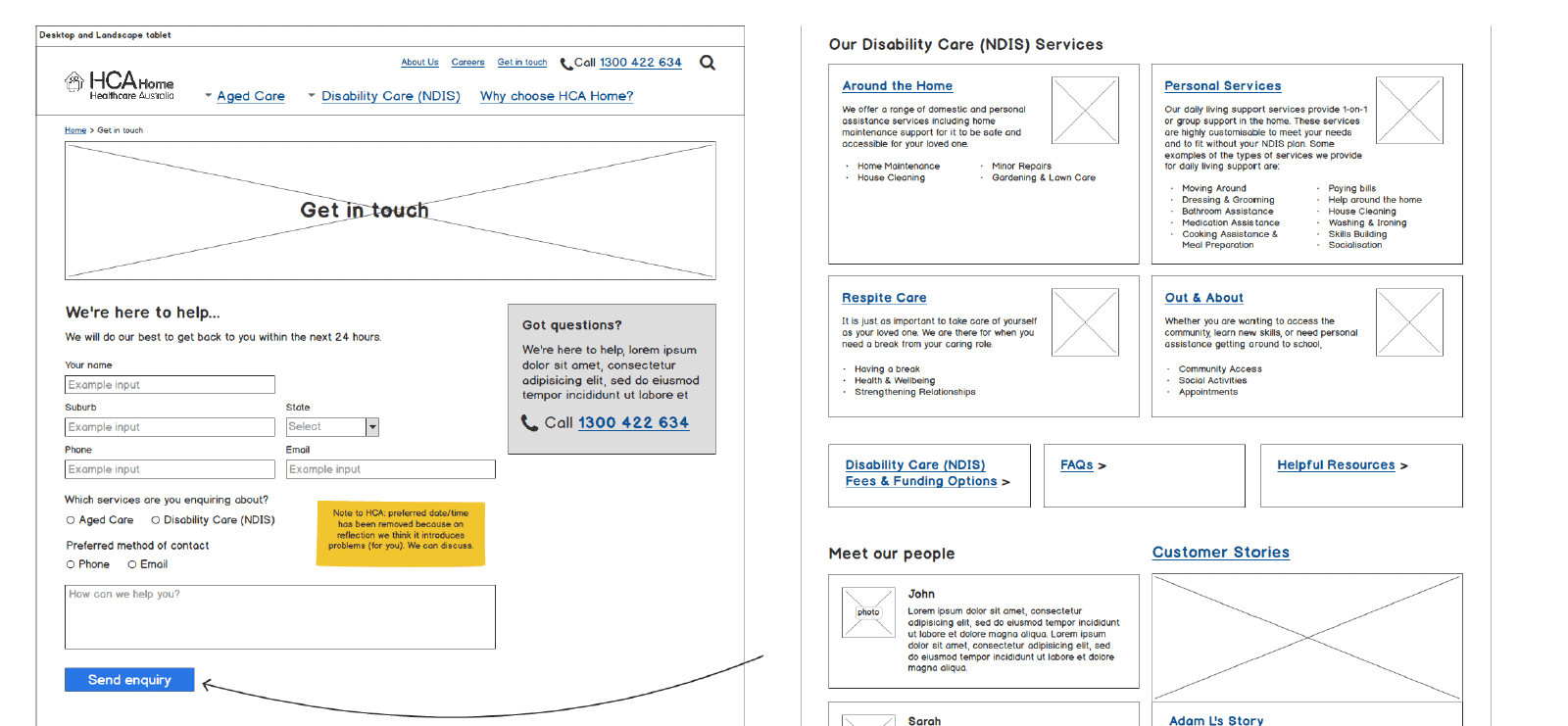
Smart contact form and disability care section.
Using webflow as a tool, I designed the UI in the form of a responsive prototype.
Key pages as well as an online styleguide was then developed.
Creating an interactive prototype instead of flat mockups allows our stakeholders to really use the site as if it were a finished product. It allows us flexibility to show how interactions work which brings everything to life.
In the UI design phase, particular detail was given to appropriate font sizes, appropriate image choice, clear call to actions and subtle interactions.
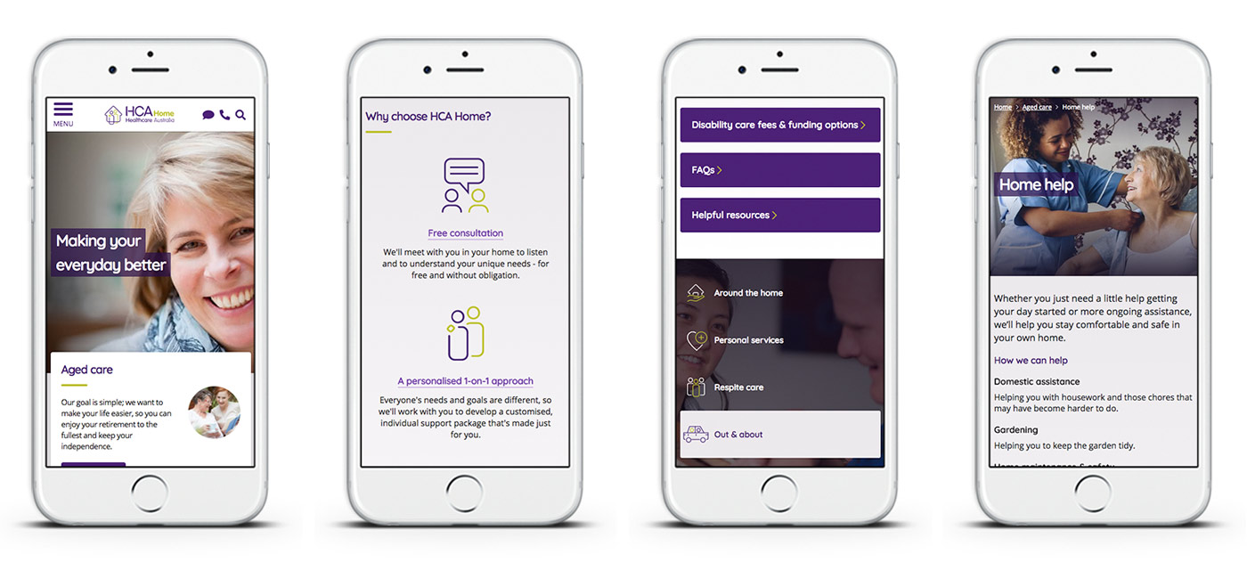
Final UI designs.
As a final piece to the puzzle, I developed an online reference guide to showcase all the user interface styles used throughout the site. This is essential for the developers to build and for future content creators for the site.
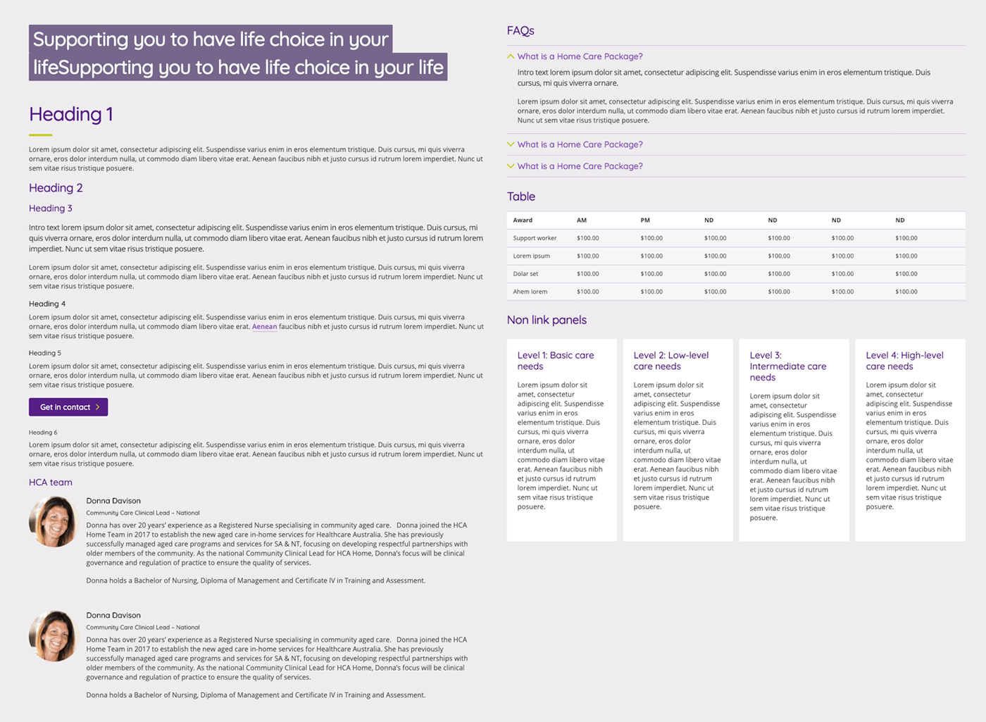
Digital pattern styleguide.
